
Private Client
2023
Design System

About Solar
My client specializes in the design and construction of solar and wind power plants. For their clients, they also build SCADA (Supervisory Control and Data Acquisition) applications to control all plant operations and monitor performance.

The Why
SCADA applications are incredibly complex and must accommodate hundreds of controls and thousands of data points. Client wanted to productize a SCADA app framework that had a vastly improved user experience, with the ability to customize interfaces for each plant.
To achieve this, they needed a cohesive and efficient design system in place. In this case study, we'll explore the process of building a custom design system in Figma, from research and planning to implementation and optimization.

Research findings
Before starting to build a design system, it is essential to understand the users' needs and pain points.
In my research activities with Client, I discovered some key insights about how users spent their day in the application and how we could simplify the experience.
Users made data informed decisions. They need to see output metrics to guide how the solar arrays were aligned.
The hierarchy of arrays was essential to operation. Users needed to quickly drill down to a single row to assess issues.
Colors are very different in SCADA. In this area of engineering, there are very specific colors that describe specific alarms or statuses. These sometimes conflicted with traditional color theory, so we needed to work around it.
Planning and Strategy
Once the user research is completed, it was time to plan and strategize the design system's development.
This includes identifying the design system's scope, deciding on the design system's components, defining the design system's guidelines and standards, and creating a roadmap for the design system's implementation and maintenance.
I was allowed to start from scratch, so I started with the atomic elements of typography, color, and iconography.

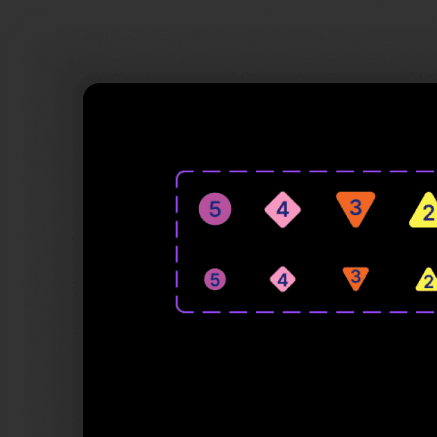
Displaying Data Effectively
Once the core elements had been established, I moved on to creating containers for displaying key pieces of data. I followed the principles of visual hierarchy and prioritized the numerical values to make it easy to quickly digest information.
The final UI created a model of user flow that could easily be adopted to a web portal environment. We tried to make it as low tap as possible while making the end to end flow feel quick and easy. Instead of making user pick a type of profile, which did not test well, we allowed them to freely create and modify a profile, and simply displayed the modification details in a given item.
Ease of Operation
As an Accessibility advocate, I'm a huge believer in labels on UI elements. Not only is it semantically accessible in code, but it also allows the user to quickly onboard to the experience and become comfortable faster.
Overcoming Resistance to Change
One of the biggest challenges we faced was getting buy-in from all stakeholders, especially those who were used to working in a certain way. We had to communicate the benefits of the design system clearly and address any concerns or objections they had.
Maintaining Consistency Across Teams
With multiple teams working on different projects, it was important to ensure that the design system was implemented consistently across all of them. This required clear guidelines and documentation, as well as ongoing communication and collaboration between teams.
Keeping the Design System Up-to-Date
As our products and services evolved, so did the design system. It was important to have a process in place for updating and maintaining the design system, as well as communicating any changes to all stakeholders.


